


Challenge
No formal design guidelines existed - each touchpoint (web, print, social) was designed in isolation. The logo had no usage rules or variables. A growing digital product (custom jewelry configurator) made a structured, extensible system urgent.
Solutions
* Logo: defined usage rules and variables for consistent application
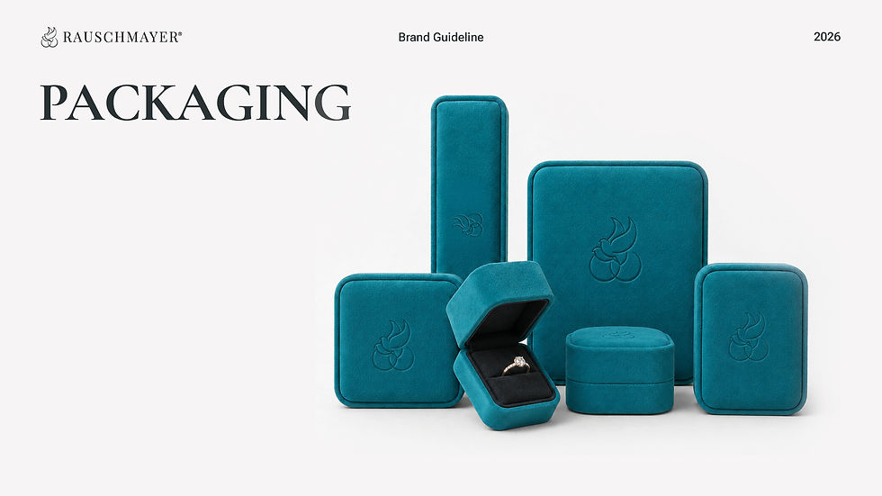
* Color: kept signature Türkis as anchor, added 2 primary + secondary colors
* Typography: new serif/sans-serif pairing replacing ad hoc choices
* Iconography: dedicated icon set for the custom jewelry platform
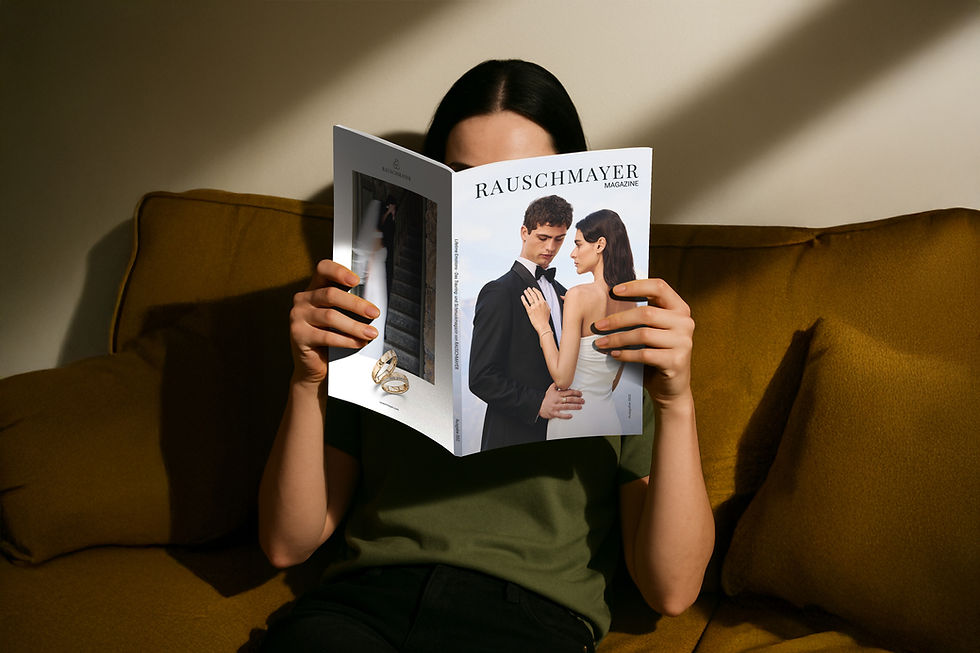
* Image language: unified standards for photo and video
Brand Identity
/ MY ROLE
Brand Identity Lead / Art Director
/ CLIENT
Confidential - a family-owned German fine jewelry house, 60+ years of heritage, undergoing a full 360° brand rebuild.
Pforzheim · 2023-2026
/ MY RESPONSIBILITIES
Defined the CI system end-to-end — color, typography, iconography, and image language across all touchpoints.
A German heritage jewelry brand undergoing digital transformation lacked a unified visual language. I built the brand identity system from the ground up, bridging its traditional roots with a digital-first future.
